Logo, what is it? What kind of logo style should I adopt for any specific business/subject or what are the types of logos?
You can think, what should be special in my logo and how can it be look different from others? What should be the color or shape or the style etc. You will find answers to many such questions here.
What is a Logo?
A logo is a design or art work used to express any type of product, scope, business in an impressive and memorable way. It is used in all kinds of promotions such as letterheads, envelopes, cards billboards, TV commercials, packaging and more. So that the consumer or audience can easily remember the organization, business or individual related to it. In short… a logo is a symbol or mark that helps in identifying and giving recognition.
How many types of Logo?
There are many ways to create a logo. Handwriting and pictures, drawings or creative shapes are used in different ways in logo designing. So that they can present a related topic in a new, memorable and effective way. Logo is very important for the upliftment of any business. So to know which style will be suitable for your business, read the following different types of Logo designs carefully.
- Emblems Logo
- Combination Mark
- Mascots
- Abstract
- Logo Symbols
- Wordmark Logo
- Lettermarks Logo
Emblems Logo
The emblem logo can be mainly identified as a badge, seal and crests. They are made with a kind of traditional appearance which has a different impact. You can see the use of such logos in schools, universities and government institutions.

This can be design primarily using text and drawings within a shape. In any other business where a logo like a seal can be used in a convenient way, this emblem logo style can be used. Such as auto industries. You must have seen the Volkswagen or Tata Motors logo.
But due to the presentation of more information, the emblem logo is sometimes not seen as effective as it could have been seen with less information. But the way this type of logos designed from an era. Gives this style it’s own recognition.
It is also little difficult to use it in small area like business cards. For this reason, many old and well-known companies have had to improve their logo from time to time. Like Starbucks.
It is not wise to show more information in complicated way through logo. You should not forget that after all you have to print your logo, then it is important to be neat and clean. There is no bad in this style, just don’t try to show the information too much.
Combination Mark Logo
If you talk about the combination mark logo design style, then this style can be considered as a mixture. Which can be done by adding multiple styles or keeping in mind any two logo design styles. In this style you will experience a mixture of Wordmark, Pictorial Mark, Abstract, Muscat Logo Design Style or Lettermark Style.
In simple and clear words pictures, shapes and handwriting are all used in a balance manner in Combination Mark Logo Design Style.
If you look at the KFC logo, you will find a great mascot and wordmark combination. In the same way you see the image of a Croco in the LACOSTE. You can also see ADIDAS logo as a great example for understanding. BURGER KING, McDonald’s, Amazon and many other examples can be taken. Just to understand, the combination mark logo style is the same as freestyle wrestling. You can imagine every kind of use in it. Due to this kind of freedom this style is very famous.
This style has proved very useful to become a brand because after some time the audience starts associating the shape used in it with your product, and in future you can only grow your business by showing only your logo in your publicity. This will not be necessary to enter your name every time. If the logo used by you has contained an exact mascot or shape inside it, then other vendors for the same product can feel to be very troublesome. It is also easier to trade marks in this category of logo style than other styles.
But far-reaching thinking and skill is equally essential in designing a combination mark logo.
Mascots Logo
Mascots logo design is a very fun style. If your field of work is related to sports or you trade a product which is related to children or you want to show your business very familiar and fun, then this style is for you.
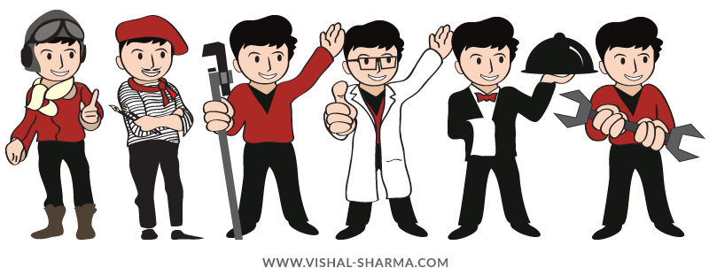
In this style brand is expressed through drawing, illustration and very colorful cartoons, in which funny portrayal of any creature, inanimate or object can also be done.
The biggest feature of this style is that you can invite your customers also only through your logo. Another great feature of this is that you are completely free to make some changes in it from time to time. You can easily show your offers occasionally and you can easily target any festival through celebrating mood in your logo. Who will know the importance of any festival more than a businessman.
Mascots style is a great way to represent yourself like a brand in the market. If you want to interact with your customers regularly or after a little period, or want to show your product or service fresh after some time, then this style will prove useful for you.
The Maharaja of Air India, the well-known Amul girl, is the identity of “Amul”, a seller of Indian milk products. Doulbhoy of Pilsbori, Cheetah Mascot of Cheetos or Italian plumber character Mario, also known as Jupam. All these famous logo examples are of mascots style. If you look at them, you will find how colorful and familiar they are made.
The main reason for this is that these brands want to present their self in-front of their customers very familiar and friendly. They want to win trust of their customers and this is also the right way.
Abstract Logo
Abstract means summary. So you can guess this logo style, with its name. Logos in this style always design on a different type of principle. This style not only shows the business, but if you study deeply, then you will also get hidden strong messages in it.
The abstract logo style is an embodiment of the specific type of pictorial logo style. They can be created mainly by geometric art and are identified by variety of shapes. In this, the power and skills of a business product is shown only by the use of shapes and art. Basically you have to design your logo in a symbolic way.
The logo of Nike swoosh shape indicates movement and speed, Adidas Flower or 3 stripes shape of a mountain, which represents the challenges and Mitsubishi Motors refers to the three-diamond are superb examples of abstract logo art. Sometimes this type of logo proves to be your help in giving you a new and different identity. By combining beautiful shapes, beautiful colors and different pattern you can spread an impression around the market for your business.
Logo Symbol
This style is also called Pictorial Mark and Brand Mark. I have also used the logo symbol in the heading so that you could understand this logo style more comfortably.

The most important thing in this style is icon or graphic image. Which should be very carefully design and should be precise. Logo should be design keeping in mind the market and business related potential customers. In this style, the use of trade names is not indicated in handwriting or by words. That is why it is necessary for business to be known beforehand.
Because you have only shape in your logo and not using your trade name due to this style. Which is very important for any new business start up. If you promote your business through any small budget campaign and your business is in the initial stage, then such logo style may not be much useful for you, “these are the possibilities”. Before adopting the logo symbol style for your business it is imperative that your business have already famous in the market.
The logos of Apple and Twitter are examples such as its milestones. The biggest challenge to get into this style is the shape used in it. Which should be made keeping in mind the possibilities of the future or with versatility. In this, you need to move your thinking to every dimension.
Wordmark Logo
The Wordmark logo is also called the logotype and is almost similar to the lettermark logo style. The name of the business is mainly used in this style. The logo created in this style is mainly based on a font.
Before adapting your logo you should be very careful in selection of font. Because in future this will about to represent your business. Color shape and style of font should reflect your business smartly. You should not only also aware of trends also should be intelligent enough for future changes.
GOOGLE Company logo is an significant example of this wordmark logo type. Before creating your logo in this style it is necessary to think deeply about the name of your company. The more attractive or different the name of your company, the greater the chances of successes.
If your company is completely new and its name is short, then the wordmark logo will prove to be a useful medium in the discussion and promotion of your company. If you keep name of the new business started by you amazing but accurate, then the effect of the logo created in this style is also unimaginable.
Lettermark Logo
The lettermarks logo is also known as the Monogram logo. The Lettermark logo style is mainly made with the help of beautiful drawing of words to present brand identity effectively.

The words are written in bold or sophisticated manner to make logo related to their business. An attempt is made to express the brand in a way that can be remembered more and more due to its style.
In this style magnificent logos are being designed using only the initials of the company’s name. The biggest strength and beauty of this style is that it is even easier to remember because of the use of only initials, which makes it less difficult to become famous and makes more possibilities.
HBO, HP and CNN are great examples of lettermark logo style. If you ask people what is “International Business Machines Corporation”, you may find the answer with little difficulties but if you ask what is IBM then everyone will have the answer.
Using your initials makes your logo smaller, and also flexible to use in any area. So you can use it anywhere, from the biggest to the smallest place with more ease and beauty. But while appointing the style of words, it must be kept in mind that it can perfectly represent the personality of your business.

